In an attempt to experimentize with the visualization tools (Dimple.js, D3.js, visualization design principles, visual encodings, HTML, CSS, SVG) I created a polished data visualization that tells a story about survival rates of Titanic disaster, allowing a reader to explore trends or patterns.
Overview
In an attempt to experimentize with the visualization tools (Dimple.js, D3.js, visualization design principles, visual encodings, HTML, CSS, SVG) I created a polished data visualization that tells a story about survival rates of Titanic disaster, allowing a reader to explore trends or patterns.
Design
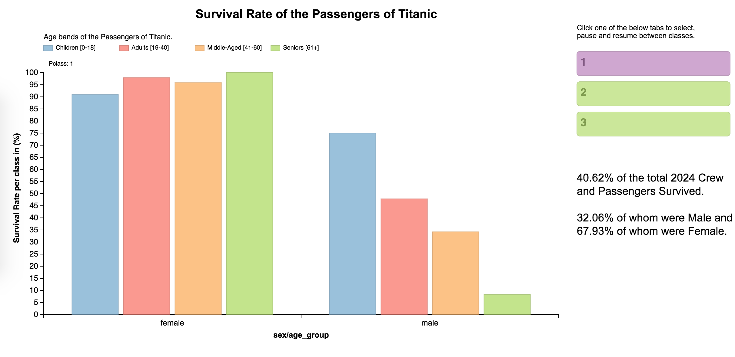
The number of peolpe survived and the gender of the passengers are the two most important information in the dataset, so they were included along the y and x axis respectively. I chose “sex” to plot along the x-axis, so that the viewer can easily differentiate between the number of passengers surviving in each group. As far as the plotting is concerned, a bar chart, was the ideal solution as “sex” is a categorical variable and survival rate is a continuous variable.
A third feuture which was equaly valuable as the rest, was “age_group” which has been added in the plot as well. As a categorical variable, this feauture was encoded it using the color hue, in order to facilitate the viewers’ percpective. A legend has been added as well on the top of the chart.
A fourth variable “Pclass” which represents the socio-economic status of the adequate customer, has been added to the plot as well. This feature has been integrated with animation and automatic rotation upon a prompt of a user, who can switch between each class using the navigation link provided in the slide.
I also modified the tooltip provided by dimple to show the percentage of different age groups people surviving in each category. I included a title and some text at the right bottom of the graph to give an overview to the users about what the graph represents.
After been provided with some feedback from frinds and coleagues concerning the graph, I made some changes. I eliminated null values, I gave real names to the age groups, I changed the legends of the plot in order for the viewer to have a better understanding of the context without spending a lot of time, I used aggragate node grouped by two consecutive variables in order to i.e. subgroup the survived males of 19-40 years-old, I tuned the D3 attributes to have the best possible visualization, and I eliminated the grid lines to make good use of white spaces. In addition, I fixed some code indentation styling issues, I fixed a miscalculated variable (survival rate) on the data and lastly I fixed the bar ordering according to labels.
Summary
When trying to compare survival rate between genders for the Titanic disaster, females had more chances to survive compared to males. As far as the socio-economic status of the passengers, those travelling in 1st class were more likely to survive than those travelling in 2nd class, which inturn were more likely to survive than 3rd class passengers. Children and Adult (< 40 years-old) passengers were more likely to survive compared to the rest age groups. This is a link of the whole project including coding and data modification. Enjoy!
